What Colors Go With Purple? 10 Easy Combinations for Outfits, Rooms and More
Wondering what colors go with purple? Get 10 purple color combinations with hex codes, plus outfit, room and paint ideas and which colors to avoid.
The best colors that go with purple are mustard yellow, soft grey, blush pink, olive green, warm cream, navy, gold and deep green. Yellow tones are purple’s natural opposite, so they make it pop, while grey and cream calm it down. Pinks and blues sit beside purple on the color wheel and blend easily.
Purple can feel tricky because it covers so much ground, from pale lavender to inky eggplant. The good news is that once you know whether your purple leans warm (reddish, like plum) or cool (bluish, like violet), choosing partners gets much easier.
The short answer: 8 colors that go well with purple
- Mustard yellow for bold, high-contrast energy
- Grey for a calm, polished look
- Blush pink for a soft, romantic feel
- Olive green for an earthy, grown-up mix
- Cream or soft white to let purple breathe
- Navy for a deep, moody pairing
- Gold for warmth and a touch of luxury
- Deep green for a rich, jewel-toned palette
10 purple color combinations that work
1. Plum and Mustard Yellow
Yellow sits opposite purple on the traditional color wheel, so this is a true complementary pair. The warmth in plum and the golden depth of mustard yellow keep it rich rather than loud. Try it in an autumn outfit or as throw pillows on a cream sofa.
2. Plum and Grey
Grey is the easiest way to make purple feel sophisticated. A mid grey softens plum’s intensity, and a pale grey keeps the room bright. This works beautifully in a bedroom, an office or a minimalist brand palette.
3. Plum and Blush Pink
Pink and purple are neighbors on the wheel, so they blend without any friction. Blush lightens deep plum and adds a gentle, feminine warmth. It is a favorite for weddings, nurseries and soft dressing.
4. Plum and Olive Green
Green is another strong partner for purple, and olive keeps it earthy instead of electric. The pairing feels natural, like ripe fruit against leaves. Use it in a living room with linen, wood and brass.
5. Lavender, Sage and White
Light purples need light partners. Lavender and sage are both soft and slightly grayed, so they feel airy and garden fresh. Perfect for spring outfits, bathrooms and spring weddings.
6. Violet, Navy and Crisp White
Navy gives cool purples a grounded, tailored backdrop. White adds contrast so the pair never looks heavy. This mix suits workwear, a dining room or a confident tech or wellness brand.
7. Eggplant, Emerald and Sand
Two jewel tones with equal depth feel luxurious together. Sand keeps the palette from going too dark. Try it in a library, a velvet-heavy lounge or an evening outfit.
8. Purple, Gold and Cream
Gold leans toward yellow, so it brings the same contrast as mustard with extra shine. Cream softens the edges. This is a classic wedding and event palette and works well for premium packaging.
9. Plum, Terracotta and Oat
Warm, reddish purples get along with burnt orange and clay tones. The mix feels cozy and a little bohemian. Use it for fall styling, a reading nook or a boutique cafe brand.
10. Monochrome Purple
Layering several purples from dark to light is one of the most elegant ways to wear or decorate with it. Vary the texture (velvet, linen, wool) so it stays interesting. This works for a tonal outfit or a calm, enveloping bedroom.
Want to test other pairings? Our color matcher shows harmonies for any shade.
Purple in clothing
Purple is a flattering color for many people once you find the right depth and temperature. A quick undertone test can help: warm undertones often look great in plum, raisin and reddish purples, while cool undertones tend to glow in violet, lavender and blue-leaning purples.
Easy outfit ideas:
- A plum sweater with grey trousers and white sneakers for an easy everyday look.
- A lavender shirt with navy chinos or jeans for work.
- A deep purple dress with gold jewelry and nude or blush shoes for evening.
- A purple scarf or bag with an olive or camel coat for a neutral outfit that needs a lift.
If full purple feels like a lot, start with one piece: a tie, a knit, a bag or a lipstick in a berry shade.
Purple in the home
In interiors, purple works best when you control its intensity. Deep purples create drama and coziness, while pale lilacs feel fresh and calm.
- Living room: a plum velvet sofa or armchair against warm cream walls, with mustard and olive cushions.
- Bedroom: lavender bedding with grey walls and white trim, or a moody deep-purple accent wall behind the headboard.
- Dining room: dark purple walls with gold lighting and natural wood.
- Bathroom: soft lilac with sage towels and brushed brass.
Purple paint colors to consider
If you want plum-toned walls, these paint colors are close to the deep reddish purple we use in this guide:
| Paint | Code | Hex | Estimated LRV | Feel |
|---|---|---|---|---|
| Blackberry Wine (Benjamin Moore) | 2074-20 | #6C3552 | about 6.3 | Deep berry purple |
| Vintage Wine (Benjamin Moore) | 2116-20 | #5F3A42 | about 5.9 | Brownish wine purple |
| Raspberry Truffle (Benjamin Moore) | 2080-10 | #7C3A3F | about 7.7 | Reddish, almost burgundy |
| Rangwali (Farrow & Ball) | No. 296 | #C4657F | about 22.6 | Bright pinky raspberry |
The first three are very dark, with an estimated LRV under 8, so they absorb a lot of light. They suit cozy dining rooms, powder rooms and accent walls. Rangwali is lighter and more playful, great for a cabinet or a child’s room. All of them are clear colors rather than neutrals, so pair them with cream, grey or soft white trim. Always test paint samples on your own walls and check them in morning and evening light before committing.
Colors to avoid with purple
Purple is flexible, but a few pairings tend to struggle:
- Red of the same strength: a bright red next to a bright purple often fights. If you love the combo, mute one of them or add plenty of neutral.
- Muddy brown: dull, flat browns can make purple look dusty. Choose warm camel, wood or chocolate with some richness instead.
- Neon brights: neon green or orange with saturated purple can look harsh. Soften one color first.
- Too many mid-tone purples: several purples of the same depth blur together. Mix light, medium and dark.
How to use the 60-30-10 rule with purple
The 60-30-10 rule splits a palette into a main color (60 percent), a secondary color (30 percent) and an accent (10 percent). It keeps bold colors like purple balanced.
| Style | 60% | 30% | 10% |
|---|---|---|---|
| Calm and modern | Soft white | Grey | Plum |
| Cozy and warm | Cream | Plum | Mustard |
| Bold and moody | Deep purple | Navy | Gold |
| Fresh and light | White | Lavender | Sage |
In a room, the 60 is usually walls and large rugs, the 30 is furniture and curtains, and the 10 is pillows, art and accessories. In an outfit, think of trousers or a dress as the 60, a top or jacket as the 30, and shoes, jewelry or a bag as the 10.
Fun facts about purple
Is purple a royal color? Yes, historically. Purple dye was once extremely expensive to produce, so for centuries purple cloth was reserved for royalty and the very wealthy. That association with luxury still lingers today.
How do you make purple? Mix red and blue. More blue gives a cooler violet, more red gives a warmer plum or magenta. Add white for lavender or black for eggplant.
What is the opposite of purple? On the traditional painter’s wheel, the complement of purple is yellow. That is why mustard, gold and lemon tones make purple stand out so clearly.
Find your purple
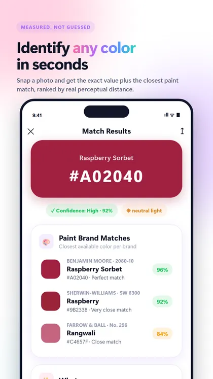
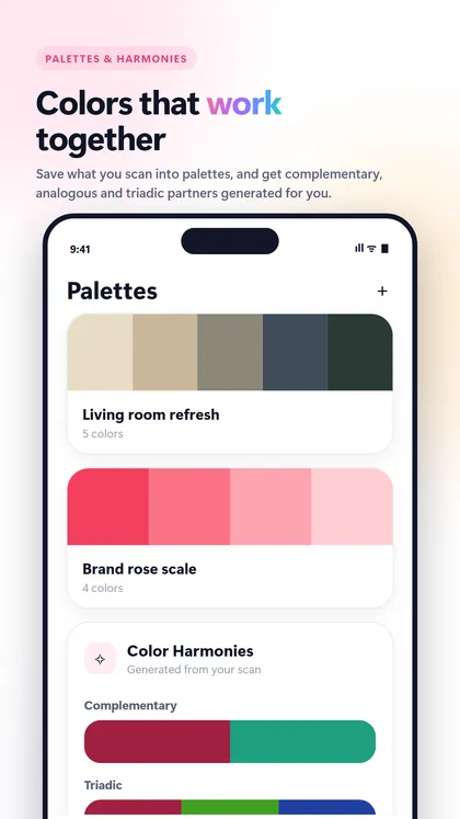
If you spotted a purple you love in a photo, a fabric or a hotel lobby, the ColorScan app (Android on Google Play, iOS coming) can identify it from a photo or the live camera. It gives the exact HEX, RGB and other values, a color name, harmonies like complementary and analogous, and the closest matches from curated Benjamin Moore, Sherwin-Williams, Behr and Farrow & Ball collections. Screen colors are only approximations.
For more pairing ideas, see our guide to what colors go with green, another natural partner for purple.
FAQ
What color goes best with purple?
Mustard yellow and gold go especially well with purple because yellow is its complementary color. For a calmer look, grey and cream are the easiest partners and work with almost any shade of purple.
Do purple and green go together?
Yes, purple and green are a classic pairing found in nature, from flowers to fruit. Olive and sage feel earthy and soft, while emerald with deep purple creates a rich jewel-tone look.
What neutral colors go with purple?
Grey, cream, soft white, sand and navy all work as neutrals with purple. Warm neutrals like cream and oat suit reddish purples like plum, while cool grey and white suit lavender and violet.
What is the opposite color of purple?
On the traditional color wheel, yellow is the opposite of purple. That is why yellow, mustard and gold create such strong contrast when paired with purple.
Is purple a royal color?
Purple has long been associated with royalty because the dye was historically rare and costly to make. Only the wealthy could afford purple fabric, so it became a symbol of power and luxury.
Keep exploring
- Color combinations What Colors Go With Brown? 10 Easy, Warm Combinations for Outfits and Rooms Wondering what colors go with brown? See 10 brown color combinations with hex codes, plus tips for outfits, rooms, paint and colors to avoid.
- Color combinations What Colors Go With Green? 10 Easy Combinations for Outfits, Rooms and More What colors go with green? See 10 green color combinations with hex codes, plus outfit and room ideas, colors to avoid and the 60-30-10 rule.
- Color combinations What Colors Go With Red? 10 Easy Combinations for Outfits, Rooms and More What colors go with red? See 10 red color combinations with hex codes, outfit and room ideas, matching red paint picks and the shades to avoid.
Recommended app · ColorScan
Identify any color with your camera
ColorScan tells you the exact color of a wall, a sweater or a lipstick, its name and the closest paint colors from Benjamin Moore, Sherwin-Williams, Behr and Farrow & Ball.
- Identify any color from a photo or the live camera
- Closest matches from Benjamin Moore, Sherwin-Williams, Behr and Farrow & Ball
- HEX, RGB, HSL, CMYK and LAB in one tap
- Color harmonies and palettes from any shot