What Colors Go With Red? 10 Easy Combinations for Outfits, Rooms and More
What colors go with red? See 10 red color combinations with hex codes, outfit and room ideas, matching red paint picks and the shades to avoid.
The colors that go best with red are navy blue, white, camel, charcoal grey, black, forest green, blush pink and soft gold. Neutrals like white, camel and grey let red stay the star, navy gives it a classic balance, and green, red’s complementary color, adds bold contrast. Pick one partner plus a neutral and you rarely go wrong.
The short answer: best colors to pair with red
- Navy blue for a timeless, grown-up contrast
- White and cream for a crisp, fresh look
- Camel and tan for warmth and softness
- Charcoal grey for a modern, calm base
- Black for drama and evening style
- Forest or emerald green for high-energy contrast
- Blush pink for a playful, tonal pairing
- Gold for celebration and a touch of luxury
The examples below use Scarlet #E0261C, a brilliant red with a slight orange tint. It is brighter and warmer than crimson, so it works with both warm and cool partners as long as you balance its intensity.
10 red color combinations that work
Red, Navy and White
This is the most reliable red combination there is. Navy is deep enough to calm red’s energy, and white keeps everything crisp. Try it in a striped top with a red bag, a coastal living room, or a confident brand identity.
Red, Camel and Cream
Camel shares red’s warmth, so the pair feels cozy rather than loud. Cream softens the contrast even more. Think a red sweater with a camel coat, or a reading nook with a red throw on a tan leather chair.
Red, Charcoal Grey and Light Grey
Charcoal grey gives red a cool, urban backdrop that feels more relaxed than black. It suits office outfits, modern kitchens and tech or finance branding where you want energy without shouting.
Red, Black and White
A graphic, high-contrast trio that never looks unsure of itself. Use it for evening wear, a bold powder room, or event posters. Keep red in smaller doses so the look stays sharp rather than heavy.
Red and Forest Green
Green sits opposite red on the color wheel, so this is the strongest natural contrast. A deep forest or emerald tone feels sophisticated instead of festive. Add cream as a buffer and it works in a dining room, a winter wedding or a heritage brand.
Red, Blush Pink and Soft White
Red and pink are neighbors, which makes the pairing feel playful and intentional. Blush keeps it light so red does not overpower. It is lovely for a spring outfit, a nursery accent wall or a bakery logo.
Red, Gold and Ivory
Scarlet has long been linked with celebration and ceremony, and gold amplifies that feeling. Ivory keeps the palette elegant. It suits weddings, holiday tables and premium packaging.
Red, Denim Blue and White
A mid-tone blue makes red feel casual and approachable. This is your weekend combination: jeans, a white tee and red sneakers, or a breezy kids’ room or cafe.
Red, Olive and Tan
Olive is a muted cousin of green, so you get contrast with an earthy, relaxed mood. It works for autumn outfits, rustic kitchens and outdoor or food brands.
Monochrome Red
All-red looks are confident, and mixing light, mid and deep reds keeps them from feeling flat. Pair a scarlet top with burgundy trousers, or layer brick, wine and rose textiles on a sofa.
What colors go with red clothes
For outfits, start with what is already in your closet. Navy, denim, white, grey, camel and black all turn a red piece into an easy outfit.
- Red dress: nude or black shoes, gold jewelry, a camel or navy coat.
- Red top: jeans, white trousers, charcoal or camel bottoms.
- Red trousers or skirt: a cream knit, a navy sweater or a striped tee.
- Red shoes or bag: the simplest way to try red; let them be the one bright spot in a neutral outfit.
Not every red flatters every person. Orange-leaning reds like scarlet often suit warm undertones, while blue-leaning reds like cherry or raspberry tend to suit cool undertones. If you are unsure which family you fall into, our undertone test is a quick place to start.
What colors go with red in the home
Red works hard in a room, so most people use it in accents: a sofa, a rug, cushions, a front door or a single wall. Warm white, greige, camel, wood tones, navy and deep green make strong supporting players.
- Living room: a red sofa or rug with warm white walls and wood furniture.
- Dining room: red walls feel cozy at night; balance them with cream trim and brass.
- Kitchen: red bar stools or a range against grey or white cabinets.
- Entryway: a red front door with charcoal or navy siding.
Red paint colors that match scarlet
True scarlet is brighter than most wall paints, so these are the closest deeper reds from our data. All have a clear undertone and are bold colors, not neutrals.
| Paint | Brand and code | Hex | Estimated LRV |
|---|---|---|---|
| Real Red | Sherwin-Williams SW 6868 | #B3352E | about 12.3 |
| Red Pepper | Behr | #A93A31 | about 11.7 |
| Caliente | Benjamin Moore AF-290 | #A63B34 | about 11.5 |
| Positive Red | Sherwin-Williams SW 6871 | #A32B2A | about 9.7 |
With LRVs around 10 to 12, these reds absorb a lot of light, so they suit doors, accent walls, cabinetry or rooms you mostly use in the evening. Red shifts a lot between daylight and lamplight, so always test a sample on your own wall before committing. You can browse more options in paint colors by brand.
Colors to avoid with red
Almost anything can work with red in the right amount, but these pairings are tricky:
- Clashing reds: an orange-red next to a blue-red often looks like a mistake. Keep reds in the same temperature unless you are layering deliberately.
- Neon green or neon yellow: too much intensity at once, and it tends to read as costume or warning signs.
- Bright orange in equal amounts: the colors compete rather than complement.
- Bright purple in large blocks: both colors fight for attention; use plum or wine tones instead.
- Too many brights: red plus two other saturated colors rarely feels calm. Give the eye a neutral to rest on.
How to use the 60-30-10 rule with red
The 60-30-10 rule splits a palette into a main color (60 percent), a secondary color (30 percent) and an accent (10 percent). Red is usually best as the 10 or the 30.
- Red as the accent (10%): 60% warm white, 30% camel, 10% red. Think cream walls, tan sofa, red cushions and art.
- Red as the secondary (30%): 60% navy, 30% red, 10% white. Think a navy suit with a red shirt and a white pocket square.
- Red as the main color (60%): possible, but pair it with a calm 30% like charcoal and a small 10% like gold, as in a red dining room with charcoal trim and brass lights.
Which colors make red stand out?
Red pops most against its complementary color, green, and against strong neutrals. Black and charcoal make red glow, while white makes it look crisp and clean. Navy gives contrast without competing. The more muted the surrounding colors, the brighter red appears.
Using the color wheel with red
A color wheel shows how hues relate, and most palettes fall into a few types:
- Complementary: red with green, for maximum contrast.
- Analogous: red with its neighbors, pink, coral and orange, for a harmonious feel.
- Triadic: red with blue and yellow, three evenly spaced hues for a lively, primary look.
- Split complementary: red with teal and lime-leaning green, for contrast that is softer than a straight complement.
- Monochromatic: light to deep shades of red.
If someone asks for the three best colors that go together, red, navy and white is a strong answer. It is a classic for a reason. To test your own combinations, try our color matcher.
Matching a red you already own
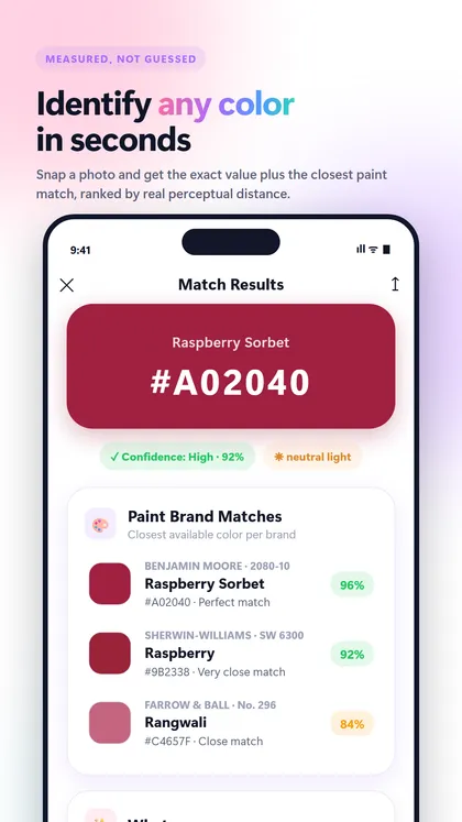
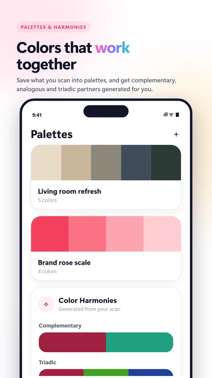
If you want to match a red cushion, a dress or a paint chip, it helps to know its exact shade first. ColorScan, an app from the makers of this site, identifies any color from a photo or your live camera and gives its HEX, RGB, HSL, CMYK and LAB values, a name and the closest matches from curated Benjamin Moore, Sherwin-Williams, Behr and Farrow & Ball collections. It also suggests harmonies like complementary and analogous. It is on Android through Google Play, with iOS coming.
FAQ
What is the best color to go with red?
Navy blue is the most versatile partner for red because it adds contrast without competing. White, camel and charcoal grey are close runners-up and work in both outfits and rooms.
What is the complementary color of red?
Green is red's complementary color, sitting directly opposite it on the color wheel. Deep forest or emerald greens tend to look more sophisticated with red than bright, grassy greens.
Do red and pink go together?
Yes. Red and pink are neighbors on the color wheel, so they create a tonal, playful look. Keep one shade dominant, such as blush with red accents, so the pairing looks intentional.
What colors go with a red couch?
Warm white, cream, camel, wood tones and grey all balance a red couch. For more color, add navy or deep green cushions and keep the walls light so the room does not feel heavy.
What color shoes go with a red dress?
Nude, black and gold shoes are the easiest choices with a red dress. Navy or camel also work well, while bright colored shoes can compete with the dress.
Keep exploring
- Color combinations What Colors Go With Brown? 10 Easy, Warm Combinations for Outfits and Rooms Wondering what colors go with brown? See 10 brown color combinations with hex codes, plus tips for outfits, rooms, paint and colors to avoid.
- Color combinations What Colors Go With Yellow? 10 Combinations for Outfits, Rooms and More What colors go with yellow? See 10 yellow color combinations with hex codes, plus outfit, room and paint ideas, colors to avoid and the 60-30-10 rule.
- Color combinations What Colors Go With Pink? 11 Combinations for Outfits, Rooms and More What colors go with pink? See 11 pink color combinations with hex codes, outfit and room ideas, colors to avoid, and blush paint picks to try.
Recommended app · ColorScan
Identify any color with your camera
ColorScan tells you the exact color of a wall, a sweater or a lipstick, its name and the closest paint colors from Benjamin Moore, Sherwin-Williams, Behr and Farrow & Ball.
- Identify any color from a photo or the live camera
- Closest matches from Benjamin Moore, Sherwin-Williams, Behr and Farrow & Ball
- HEX, RGB, HSL, CMYK and LAB in one tap
- Color harmonies and palettes from any shot